Descriptive Analyses & Visualisations
We start with an introduction to descriptive statistics and visualising descriptive data. Subsequently, in the workshop, we will briefly focus on data cleaning, specifically getting and cleaning data, crucial for data lab tomorrow. For the rest of the workshop, we will practice doing exploratory data analyses wherefore descriptive statistics and visualisations are fundamental.
0) Learning Objectives
Fundamentals of Exploratory Data Analysis, specifically you will learn to understand and apply:
- Data Cleaning: getting your data in the right shape to analyse.
- Descriptive statistics: Measures of central tendency and spread.
- Descriptive visualisations: Measures of central tendency and spread.
Table of contents:
- Introduction: 1 hour
- Workshop: 6 hours
- Mock-Assignment: 0.5 hours
Questions or issues?
If you have any questions or issues regarding the course material, please first ask your peers or ask us in the daily Q&A at 16:00!
Good luck!
1) Introduction
First, we will explore how we can describe and interpret our raw data without analysing any causal relationships. In other words, we're going to look at what we can tell about the data by itself. "Descriptive statistics are brief descriptive coefficients that summarise a given data set, which can be either a representation of the entire or a sample of a population. Descriptive statistics can be divided into measures of central tendency and measures of variability (or spread)." (investopedia, Retrieved 14-07-2021)
Measures of Central tendency
These essentially describe the center of the dataset:
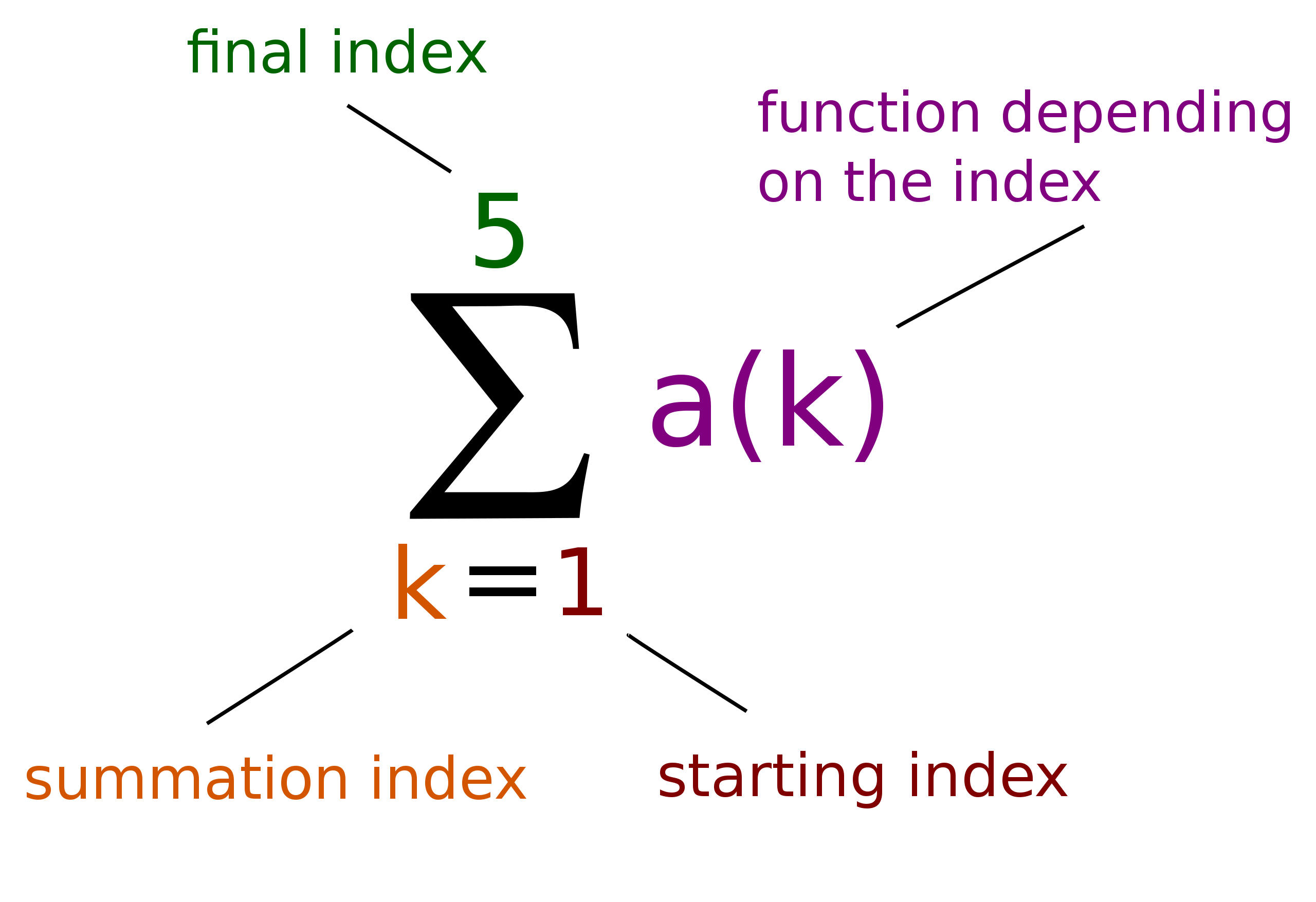
Sigma notations
A brief introduction, or refresher, to Sigma notations. Something which will be used frequently.
###Some short Exercises
Do some practical exercises on Khan Academy. Don't continue with the rest of course, just finish the exercises on the linked page.
Measures of Spread (or Variability)
Which describe the dispersion with the dataset:
Data Visualisation
It's really helpful to visualise data: most people intuitively know how to read a graph but don't have a clue when given the same scientific relationships in writing or math. Visualising data allows us to use more of our sensory capacity, enabling us to learn and understand data better. Of all the data your 5 senses provides, the data your eyes provides is by far the richest dataset (80% of all sensory data used for cognitive processing).
Better yet is multi-modal perception of information; or data. Essentially, this is a fancy way of saying that you learn better if the information is presented in multiple ways and through multiple senses. Animation and text: multiple ways of saying the same thing. Animation and narration: multiple senses are giving the same or complementary information. Multi-modal perception is scientifically proven to improve learning and understanding. A prime example in data visualisations is explicitly allowing viewers to use their spatial awareness to understand concepts: like graphs or charts. Therefore, the visual presentation of data is a game-changer to get a better understanding and intuitive feel of the data.

We (mostly) have Renee Descartes with his cartesian coordinate system to thank for graphical representations of data as we know today: enabling us to use algebra to describe geometry. Or in other words: translate numbers using math into a shape to represent the information contained in the data.
2) Workshop
Exploratory Data Analysis sadly takes a lot of practice, so that's what we'll do. You'll be looking up information, assessing, cleaning data and creating descriptive statistics and visualisations of data.
So let's get cracking!
Step 1
Download the R swirl course Getting and Cleaning Data by running the following code in the R-studio console:
swirl::install_course("Getting and Cleaning Data")
Complete module 1: Manipulating Data with dplyr.
Step 2
Download the R swirl course Data Analysis lessons directly from the Swirl Git repo and install the lessons manually from GitHub. Then complete all 3 modules: Central Tendency, Data Visualisation and Dispersion.
Hint: You can download the course directly from GitHub using a function or from a zip file when you download the course using your browser.
For help use:
?InstallCourses
If you get stuck, first ask your peers and then us. We're available from 9:00 to 17:00 as usual.
3) Mock-Assignment
Create an R script called "MeanMockAssessment" for this excercise.
A) Quick exercise: Now calculate the mean using (R as) a calculator. Open R-studio and run the following code:
sample(1:100, 10, replace = TRUE)
Now we generated 10 observations which have a random value from 1 to 100.
The mean is the sum of all the values divided by the amount of observations(N).
Or in other words:
The sum of all values/the number of observations
B) Now translate the following function to a signma notation:
sample(1:100, 10, replace = TRUE)
Hint: the "sample()" function goes on the place where the formula goes typically.
Save your script to your GitHub repository.
4) Daily Q&A
At 16:00, there's a online meeting on our Microsoft Team Channel you're encouraged to take part in to ask questions and to discuss our progress and reflect on today activities.
The End
That was it for today; tomorrow, we'll continue until module 10. Then we'll perform an exploratory data analysis on our own data based on the problem statement and research question we made in the previous data lab (Datalab_00_SDG_Indicators).
Resources
- Swirl Student Page
- Swirl
- Learning Statistics with R, by D. Navarro (2018)
- Discovering Statistics using R, A. Fields et al. (2012)
- Freina L and Ott M (2015) A literature review on immersive virtual reality in education: state of the art and perspectives. In: The International Scientific Conference eLearning and Software for Education, volume 1. pp. 10–1007.