Data visualization in Power BI

1. Introduction
The last independent study day of Week 3 focusses on the thing that makes Power BI so powerful, - i.e. beautiful visuals that can be created in a split second:
Power BI has extraordinary visuals that can be used on Power BI reports and dashboards. In this module, you will learn when to use which visual to solve which problem. You will also learn report design and report formatting. Additionally, you will learn how to use report navigation to tell a compelling, data-driven story in Power BI. Dashboards will help your users target report visuals to meet their specific needs. Paginated reports help you create pixel-perfect report artifacts like sales invoices, purchase orders, medical records, transaction statements, and much more (Microsoft Certified: Data Analyst Associate, Visualize data in Power BI).
When you are finished with this section, you should be well prepared to create a Power BI dashboard that conveys a compelling data story.
2. Building a dashboard report in Power BI
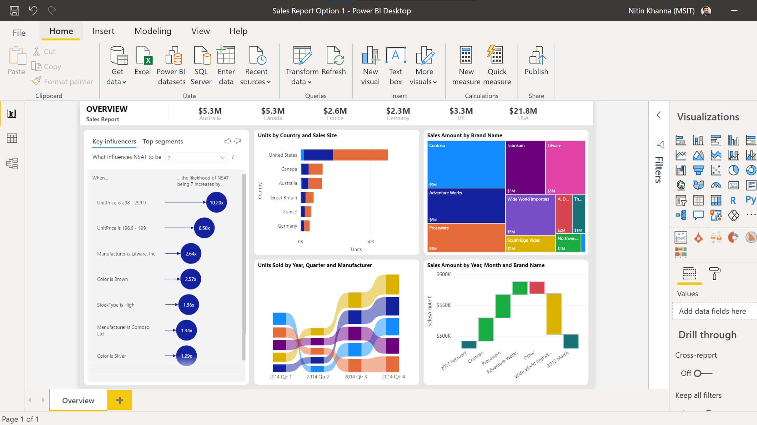
Figure 1. Power BI dashboard example
2a Complete the module Work with Power BI visuals, Create a data-driven story with Power BI reports, Create dashboards in Power BI and Create paginated reports of the Microsoft Certified: Data Analyst Associate tutorial, which you can find here.
2b Complete Module 7 - Create Reports (Part 1 & 2) lab exercise, which you can find here.